5 Tactics for Choosing Symbol Formats for Your Warnings
Posted by Clarion Safety Systems | 5th Mar 2018

In our daily conversations with product safety engineers and workplace safety professionals, the symbols to use on their safety labels and safety signs is consistently top of mind. The choices can be complex – especially in light of the latest ISO standards update.
What style symbol should you use? How many symbols should be shown? What are so-called “supplementary symbols”?

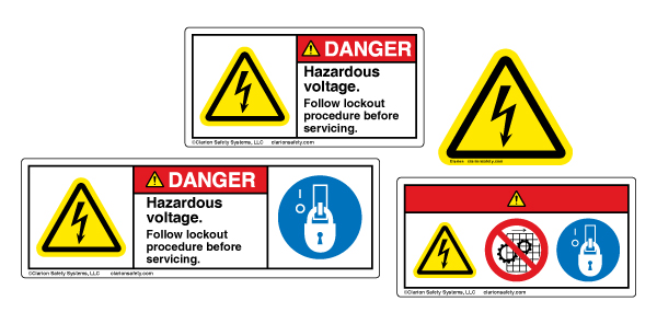
Examples of ANSI/ISO options for the symbols and formats you use for your safety labels and signs
There are many factors at play depending on your product or your workplace. It’s also important to keep in mind that there’s not necessarily one correct choice to be made. You need to look at your options – the benefits and considerations of each – to see what fits the needs at hand in order to create the best warning system possible for your product or facility.
Where do you start? Here are 5 key tactics to help guide your symbol format choices:
- Know the latest ANSI and ISO standards well, and which applies best to your products or workplace, and to your audience and market.
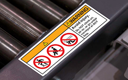
- Symbol use is optimal. While space limitations may be an obstacle on products, especially depending on your label format choice, multiple symbols can be beneficial to reinforce each other and visually convey more complete hazard-related information.
- Know what constitutes “best practices” for the symbols that match up with your safety messages. When it comes to most effectively increasing safety and reducing risk, the symbols you use should come from the most up-to-date standards or be drawn using ISO standards-based illustration techniques. Ideally, use standardized symbols, like those in ISO 7010.
- Use of an ISO-formatted surround shape around a safety symbol may be considered.If your goal is to comply with the ISO standards, it’s a necessary component. If your goal is to comply with the ANSI standards, there may be reasons not to include the surround shape, such as if space or legibility is an issue (symbols can be reproduced larger without the surround shape).
- Text can assist in training on the symbol’s meaning and elaborate on the message being conveyed in your warning. However, there may be instances when wordless formats are a good alternative, such as when warning in multiple languages is an issue.
For more information, read our recent article featured in In Compliance Magazine . You can also reach out to us at any time – we’re here to help!