Safety Sign Symbols Decoded
Posted by Geoffrey Peckham | 11th Oct 2017

Have you ever felt like you know what a symbol means but you don’t know exactly how you came to that understanding? That’s not unusual. The “vocabulary” of symbol design is based a lot on principles that, when used well, create images that we easily recognize and understand.
Fundamentals of Good Design
At the root of great symbol design is the familiar. What I mean by this is that the design of graphical symbols most often is not invented from scratch; it borrows design features from prior symbols and recombines them in new ways to create new messages and new meanings. Think about the human form as portrayed in public information signs and in safety signs. The shape of the head, the form of the body, and the overall structure of the figure is a constant – though it may be bent or turned in a certain way. What gives a new symbol that contains a human figure its unique meaning is the context in which the human figure is placed, its interaction with other symbol elements, and the way the figure is positioned.

Conveying the ‘Watch Your Children’ Message
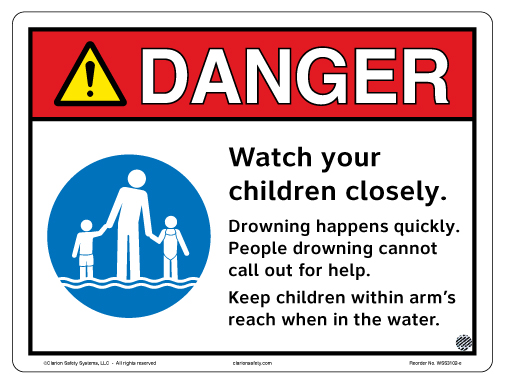
As an example, let’s look at the evolution of a particular symbol that Clarion designed: the symbol to convey the message “Watch your children – keep them close.” First, for our purposes as a
safety sign company, this is a safety message; in certain environments children that are not closely supervised can be hurt or killed. Think beaches and pools, where there’s a risk of drowning. Think roads and traffic, where there’s a risk of being hit by a car. Think national parks, where there’s a risk of getting lost or falling. These potential risks represent serious situations and adults often need to be reminded of the need to closely watch their children.
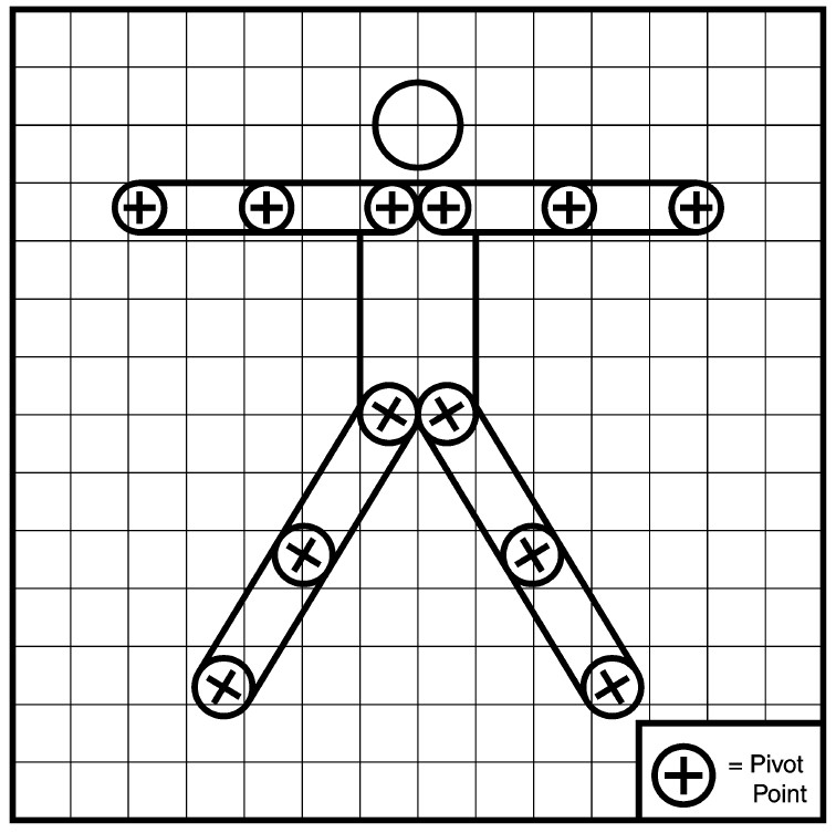
Beginning Designs
Clarion’s design department started with the human figure template that ISO/TC 145 publishes for all to use, shown below.
Then we looked at how the “parents/children” are depicted, such as in this “Family Restroom” sign:
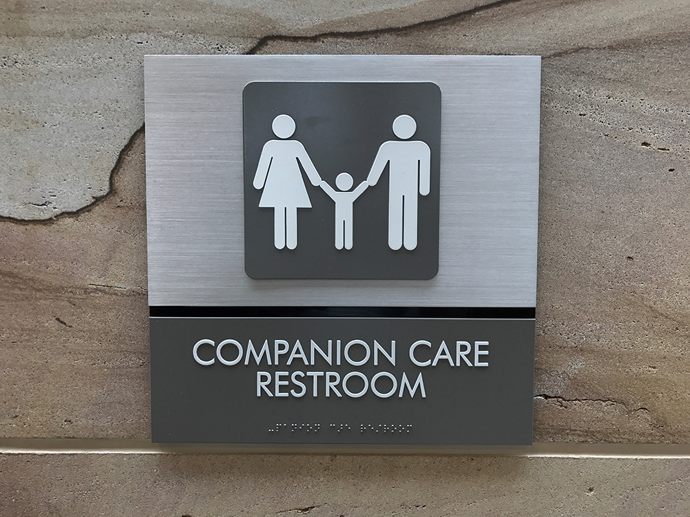
Note how female figures are shown wearing a dress. We decided that both “boy” and “girl” figures were needed for the new symbol so we could show the plural, “children.” We depicted one generic adult stooped over holding the hands of two slightly different sized children. In this way, both genders of parents and various age ranges of the children would be included by the sign’s message.
Types of Safety Messages
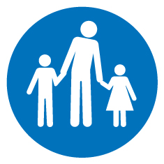
Since this was a safety message, we needed to see if it was a “warning” sign, a “prohibition” sign, or a “mandatory action” sign. Our conclusion was that it was a “mandatory action” sign because it was stating a required action. We then made the new symbol white and placed it inside a blue circle – the ISO color scheme and shape for mandatory action safety signs.
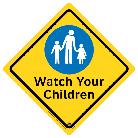
To further support comprehension, we placed the new symbol inside different sign formats that included text to train and reinforce the safety message conveyed by the symbol.
Evolution of Clarion Symbols and Signs
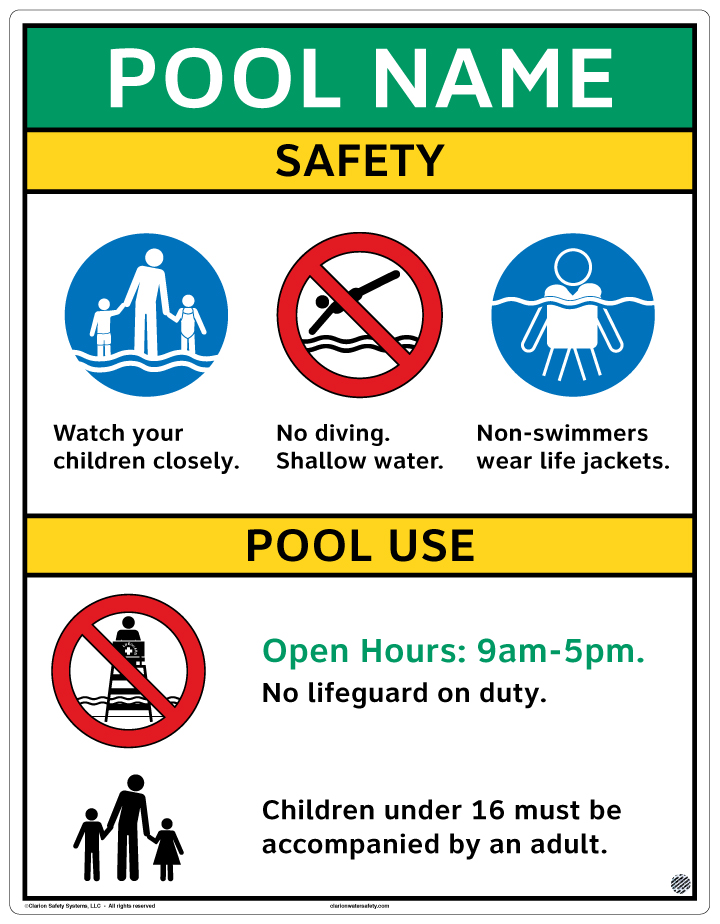
Our design department didn’t stop there. When the situation for the intended sign was an aquatics facility or beach, we took our new “base” symbol and added swimsuits and water. The text for these types of signs also changes to meet the risk communication requirement for the environment at hand.
|
|
|
Aligning with the Global Approach to Symbolic Communication
The interesting thing here is that we invented two new symbols, but the principles for their design are ones people would recognize if they were familiar with the vocabulary of safety signage. It’s true that in the U.S. we’re not as used to seeing “mandatory action” signs (white symbols in blue circles). But as with other signing conventions that are put into use over time, like the red circle-with-slash prohibition signs, this global approach to symbolic communication will become second nature to us. And that is the goal – we’ll be familiar with
new symbols and signs before we even see them!
Geoffrey Peckham
Founder, Clarion Safety Systems

This blog is part of a series of posts to share insight from our founder, Geoffrey Peckham. For nearly three decades, Geoffrey has played a vital role in leading U.S. and international standards harmonization efforts for product safety labels and workplace safety signs, including evacuation pathmarking systems. He currently serves as chair of the ANSI Z535 Committee for Safety Signs and Colors, chair of ISO/TC 145 – Graphical Symbols, and is a member of many industry-specific standards committees.